
Having touched upon the fundamentals of AWS Amplify and its components in the preceding blog,
we now shift our focus to building a full-stack application with AWS Amplify.
Table of Contents
- Project Preview
- Initial Setup
- Create a Data Model
- Create Sample Data
- Create User Interface
- Sync Figma with Amplify
- Bind User Interface with Data
- Create Collection
- Pull components into local React App
- Importing Component and Test
- Summing Up and Looking Forward
Project Preview
We are going to build a simple yet dynamic car database application. This tool not only displays a diverse collection of cars but also enables users to effortlessly create, update, and delete car records. By adding a layer of security, we're incorporating user authentication into the mix. Get ready for an in-depth exploration of UI design and a firsthand encounter with Figma integration within the Amplify framework. As we delve deeper, we'll uncover Amplify's additional capabilities, including authorization rules, storage options, and the intricacies of hosting applications.
Blog Division
This blog takes you through the creation of our application, covering everything from setting up the database model and designing UI components to implementing key functionalities and presenting the application in React. In the next part of the series, we'll elevate the application by incorporating more features, integrating user authentication, and delving into hosting and other aspects of AWS Amplify.
Without further ado, let's dive right in!
Initial Setup
These are the initial steps for setting up our application on AWS Amplify:
- Log in to your AWS account.
- Navigate to AWS Amplify from the management console.
- Choose 'Build an app'.
- Let's name our application
amplify-carstore. - Select 'Confirm Deployment'.
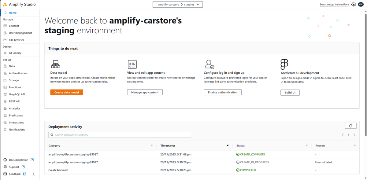
After initiating this process, Amplify will autonomously generate all the essential resources in the background. Once the deployment concludes, open Amplify Studio, and the interface should resemble the following screen:
Create a Data Model
Data models are conceptual or visual representations that define the structure and relationships within a database. They provide a way to organize and structure data, allowing for the definition of entities, their attributes, and the relationships between them.
To create a data model, navigate to Data in Amplify Studio and select the 'Add model' button.
Let's create a CarModel model with the following attributes:
- name
- manufacturer
- transmission
- maxPower
- topSpeed
- image
- about
Choose the proper data types for each attribute accordingly.
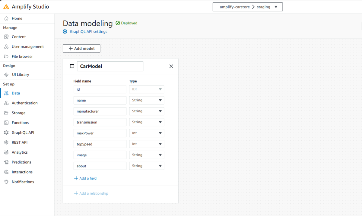
After confirming the above attributes, select Save and Deploy. The deployment will commence and will be carried out through AWS CloudFormation in the background.
Create Sample Data
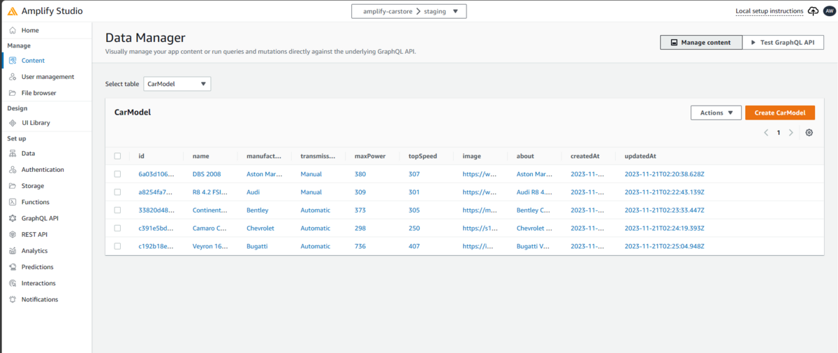
Once our Cars data model is deployed, we need to create some sample data for our data model. This data can later be viewed when we create our webpage.
Navigate to the Content page within Amplify Studio. From there, go to Actions -> Auto-generate data. Specify the desired number of items to generate; for instance, I'll choose up to 5 items. Following this, you can customize and add relevant information to these items, aligning them with our Car data model.
Create User Interface
Now that our data model and content have been created, it is time to design our UI through Figma. Designers can use Figma to create, share, and edit designs collaboratively, fostering efficient teamwork in the design and prototyping process. The integration of Figma with Amplify streamlines the process by seamlessly incorporating UI components directly into our React code.
We will be using the Amplify UI Kit as the base for creating our UI components.
The following link can redirect to the Amplify UI Kit library:
Open the above link and select the 'Open in Figma' button. Log in to Figma or create a new account, and you'll be redirected to the Amplify UI Kit Library in Figma.
You can explore this library and discover the wide range of components that can be used by an application interface. Take some time to familiarize yourself with Figma. Navigate to the 'MyComponents' page. We'll be editing some components here and then integrating them into our code.
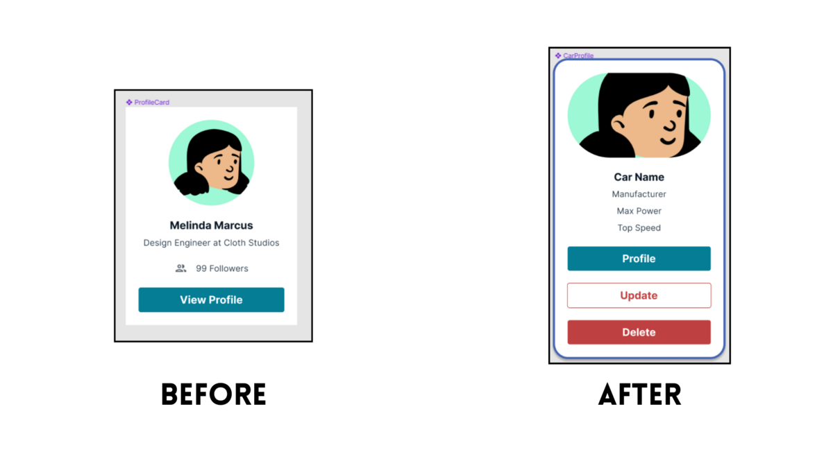
Locate the ProfileCard component and customize it by incorporating values that align with the attributes of our CarModel data model. Figma provides a range of editing capabilities, allowing you to modify font styles, colors, sizes, add or remove text fields, round edges, adjust spacing, add margins, change background colors, and much more. Feel free to explore and even create your own unique components.
Ensure that the component includes three buttons labeled Profile, Update, and Delete. These buttons will serve as the interface for updating, deleting, and viewing car profiles, and we'll later incorporate the corresponding functionalities for each.
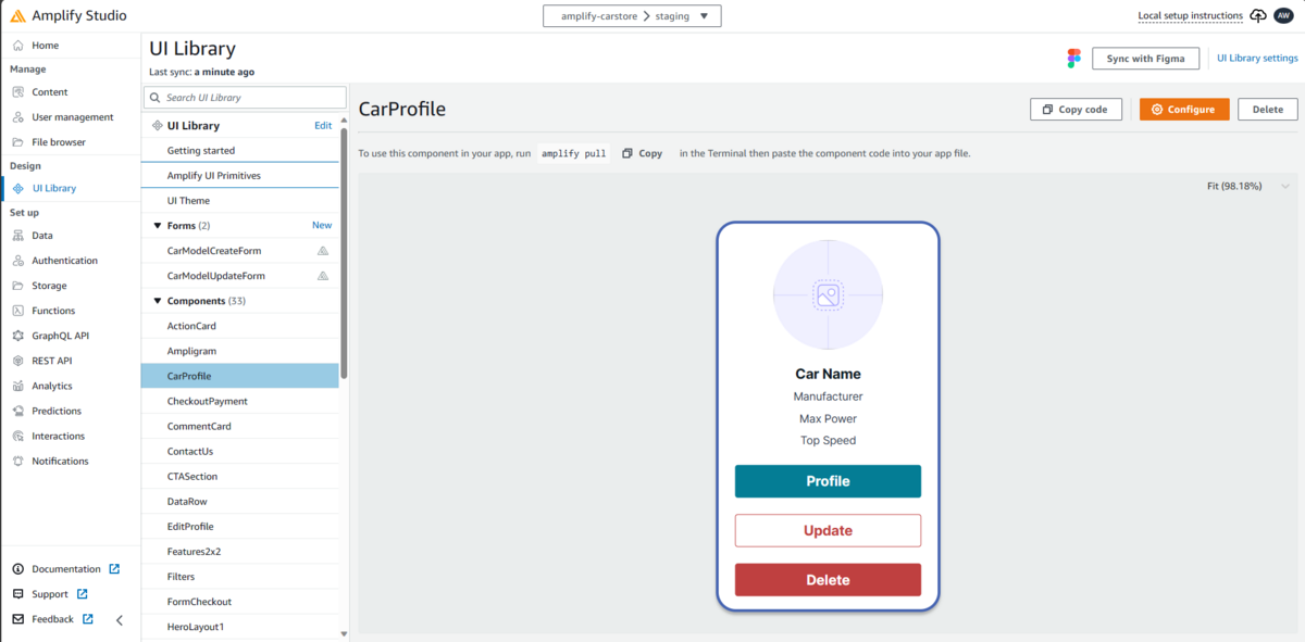
Here is how I customized the ProfileCard component. Make sure to rename the component to 'CarProfile' since we will be using it in our code with the same name.
Sync Figma with Amplify
After finalizing UI components, we can now sync our Figma with Amplify to import all our Figma components into Amplify Studio.
In Figma, click on the Share button and choose Copy-Link. This will copy your Figma file link to your clipboard. Head over to Amplify Studio and navigate to the UI Library.
Here, select the Sync with Figma button present on the top right of the screen. Paste the link you had copied from Figma at this point, and then proceed with Continue. At this point, Amplify might ask you to allow access to your Figma account. It is necessary to allow this since Amplify needs this permission to interact with Figma.
Proceed by selecting Accept all changes.
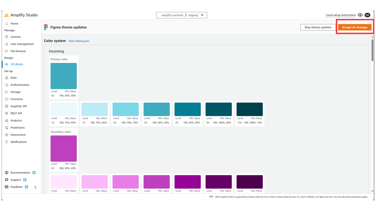
Notice that all components from Figma have been imported into Amplify Studio. Under components, confirm that the new component 'CarProfile' has also been imported.
NOTE: We would repeat the above procedure whenever new changes from Figma needed to be imported into Amplify Studio.
Bind User Interface with Data
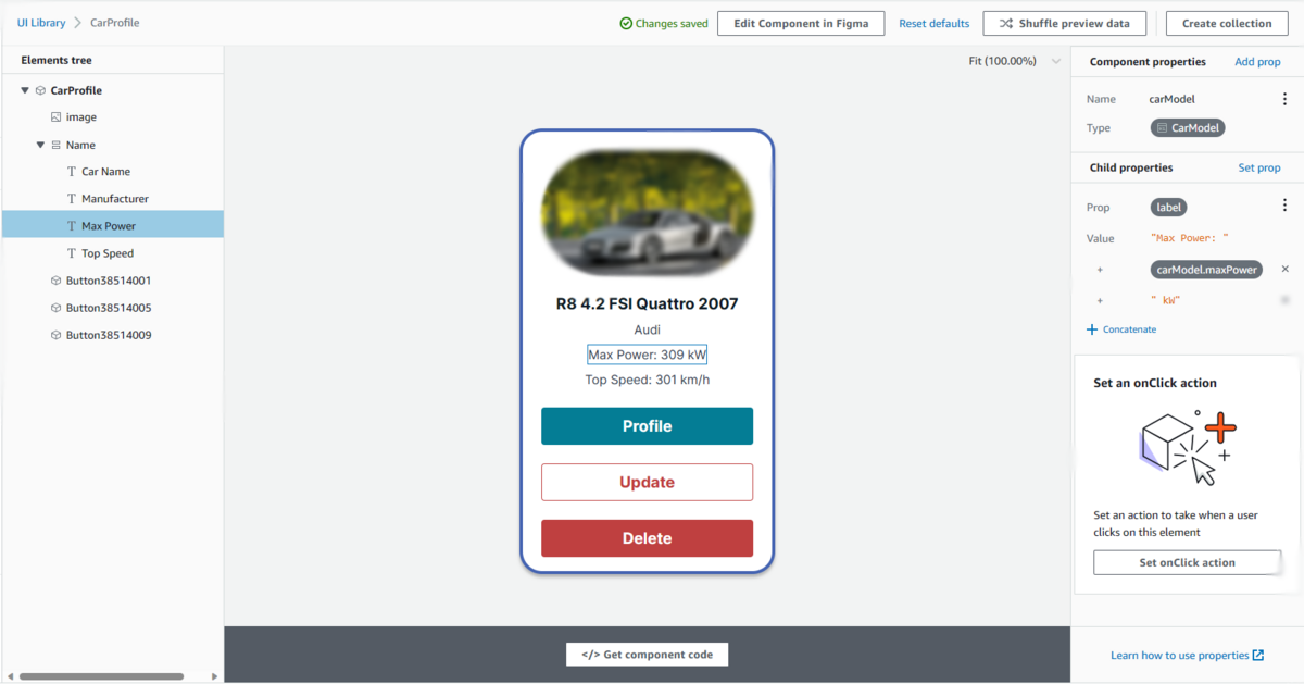
Now it is time to bind our data model with the user interface we created. Select the CarProfile component in Amplify Studio and select Configure.
As you would select text labels like 'Car Name', you would notice getting an option for binding labels to data on the right. Under the Bind label to data, select the Set text label. This would create a new child property for the label. Select carModel.name from the value drop-down list. Immediately, you would notice the name label was replaced with the name of one of our cars. And so this UI component is bound to our 'CarModel' data model. Similarly, bind all other text labels as well as the image with the appropriate CarModel attribute.
String Concatenation
String concatenation is also possible here by clicking on the '+ Concatenate' button in the Child Properties of an element. In this case, we would use string concatenation for our 'Max Power' and 'Top Speed' text labels.
Click on Suffle Preview Data to confirm all items from the data table can be loaded into the CarProfile component.
Create Collection
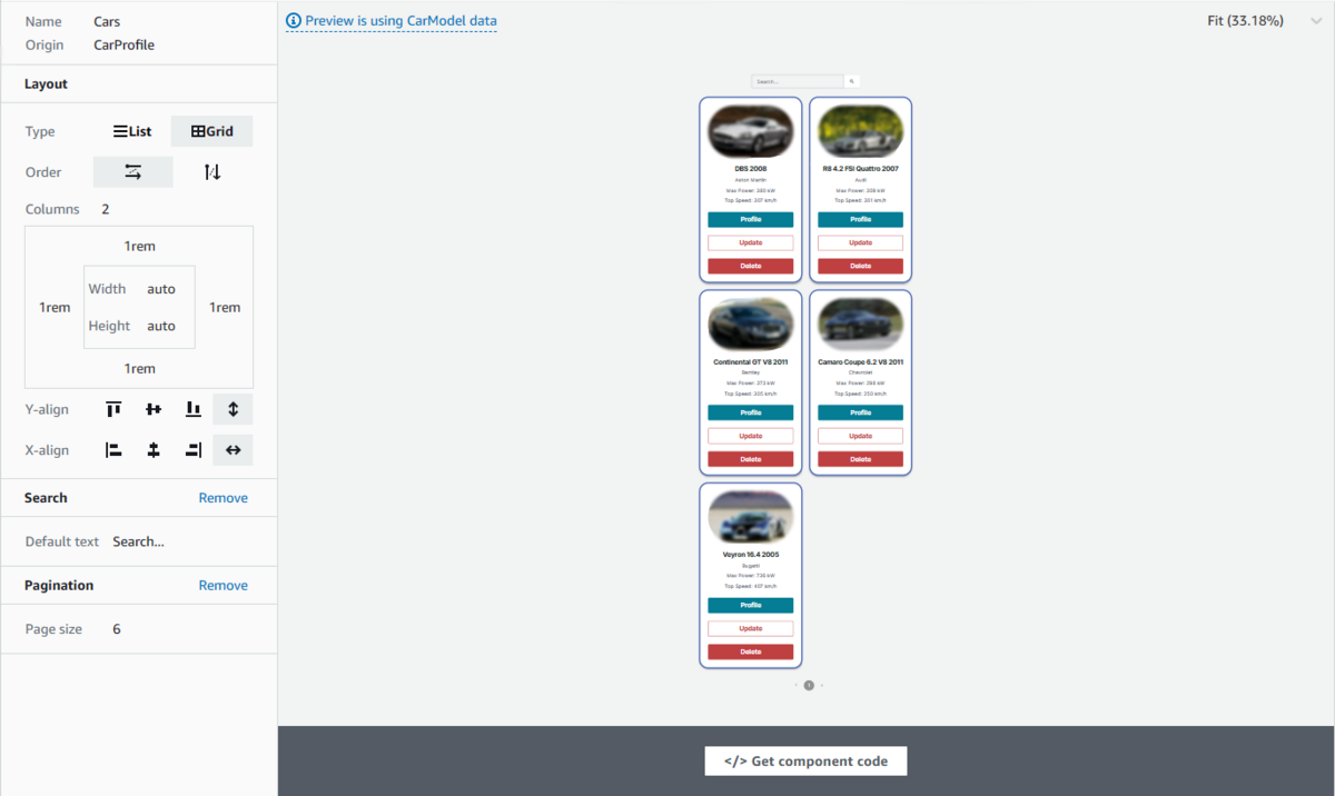
A collection in Amplify is a component that can display all items of a data model through lists and grids based on individual UI components.
To create a collection in Amplify Studio, we would select our CarProfile component and select Create Collection. Let's name the collection as 'Cars'. The next page shows the collection being created. You can choose a list or grid view based on your preference. Collections offer the ability to add padding and margins to the individual components. A pagination and search bar can be added by simply selecting their respective buttons. It's that simple! Customize your collections according to your desired preferences, and then we can move on to the next step.
Pull components into local React App
Now it's time for us to test whether we can import these components into our React code. For that, we must initially set up our React app locally. Make sure npm and npx are installed locally before setting up our app.
First, let's begin by installing Amplify CLI into our local system:
$ npm install -g @aws-amplify/cli
Once this installation is complete, proceed to build a React app, amplify-carstore.
$ npx create-react-app amplify-carstore
$ cd amplify-carstore
After the React app is created, we now need to install the Amplify ui-react library.
$ npm install aws-amplify @aws-amplify/ui-react
Now that the npm dependencies installation is complete, we need to edit the src/index.js file before we start pulling from Amplify Studio. We will edit the index.js file with some additional import statements and wrap the <App/> component with ThemeProvider. Here is the final index.js code:
import React from "react";
import ReactDOM from "react-dom/client";
import "./index.css";
import App from "./App";
import reportWebVitals from "./reportWebVitals";

import { ThemeProvider } from "@aws-amplify/ui-react";
import { Amplify } from "aws-amplify";

import awsconfig from "./aws-exports";

import "@aws-amplify/ui-react/styles.css";
import { studioTheme } from "./ui-components";

Amplify.configure(awsconfig);

const root = ReactDOM.createRoot(document.getElementById("root"));
root.render(
  <React.StrictMode>
    <ThemeProvider theme={studioTheme}>
      <App />
    </ThemeProvider>
  </React.StrictMode>
);

reportWebVitals();
And now we can pull our components from Amplify Studio into React. Back in Amplify Studio, select the Local setup instructions presented at the top right of the navigation bar. Copy the amplify pull command to your clipboard. Paste and run the command in your React code folder.
$ amplify pull --appId <appId> --envName staging
At this point, you would be prompted by your browser to allow you to login to your Amplify CLI.
Upon returning to the React code terminal, the Amplify CLI will prompt for preferences. Select options based on your system requirements; nevertheless, in most instances, default options are considered correct.
⠧ Confirm login in the browser or manually paste in your CLI login key:
Successfully received Amplify Studio tokens.
Amplify AppID found: <AppId>. Amplify App name is: amplify-carstore
Backend environment staging found in Amplify Console app: amplify-carstore
? Choose your default editor: Visual Studio Code
√ Choose the type of app that you're building · javascript
Please tell us about your project
? What javascript framework are you using react
? Source Directory Path:  src
? Distribution Directory Path: build
? Build Command:  npm.cmd run-script build
? Start Command: npm.cmd run-script start
✅ GraphQL schema compiled successfully.
This configuration is only necessary during the initial launch. For any future modifications in Amplify Studio, simply utilize amplify pull to seamlessly integrate the changes into our local code.
Confirm that all UI components are downloaded locally. Navigate to src/ui-components. This folder should contain all our UI components present in Amplify Studio.
Importing Component and Test
All the steps required for our setup are done! We just need to test whether our collection can be rendered on a webpage through React.
First, let's edit our src/App.js by importing our collection component and then rendering the component.
import "./App.css";
import { Cars } from "./ui-components";

function App() {
  return (
    <div className="App">
      <header className="App-header">
        <Cars />
      </header>
    </div>
  );
}

export default App;
Finally, import the graphql mutation into your project with the following commands:
$ amplify codegen add
$ amplify pull
This should create a src/ui-components/graphql with the necessary javascript files for mutations, queries, and subscriptions to your data models.
That's it! It's time to launch our React app and test whether the collection can be successfully rendered on our webpage.
$ npm start
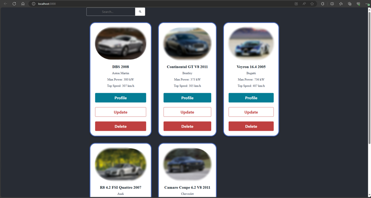
It works! We have successfully pulled our components from Amplify Studio and rendered them through our React code.
Summing Up and Looking Forward
In summary, our journey has equipped us with the skills to set up and configure an Amplify app seamlessly. We delved into the art of crafting UI components using Figma and seamlessly binding them within Amplify Studio. Additionally, we explored the local setup of Amplify CLI, mastering the process of pulling components from Amplify Studio and effortlessly rendering them on our React webpage.
In the next blog installment, our focus shifts to enhancing our project further. We'll be diving into setting up the crucial functionalities for updating and deleting car profiles, along with crafting a user-friendly UI for viewing these profiles. By adding another layer of security and personalization, we'll introduce user authentication to our application. We'll also have an insightful overview of advanced Amplify concepts, including authorization, storage, and hosting. Stay tuned for an exciting journey ahead!
Author
Rahul Raje
JTP Co., Ltd.