
Previously, we mastered the art of crafting an app on AWS Amplify—from creating intricate UI components on Figma to seamlessly synchronizing them with AWS Amplify. With each step, we imported these components into our local React code, ensuring smooth rendering. In this blog, we embark on the next leg of building our app, exploring new features, and advancing our project. So, without further ado, let's begin.
Table of Contents
- New Components
- New Components configuration
- Importing Components in Code
- Adding and Updating Cars
- Deleting a Car
- Adding Authentication to our App
- Additional Amplify Features
- Cleanup
- Closing Thoughts
New Components
We need to create and add the following components:
- Navbar component
- AddCar component
- CarDetails component
The process for creating the components remains the same as we had seen previously:
- Create or edit a component in Figma.
- Syncing with Figma in Amplify Studio.
- Configure components in Amplify Studio.
- Pull from Amplify into local React code using the Amplify CLI.
- Import components into the React code to render them on the webpage.
These are the new components we will create after editing the existing components on Figma:

Let's sync Figma with Amplify in Amplify Studio and configure these components.
New Components configuration
For now, no configuration is required for the Navbar component.
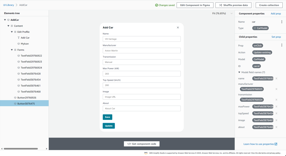
We need to add a component property for our AddCar component.

Let's configure the CarDetails component in a similar way as we configured our CarProfile component.

Importing Components in Code
We will import the newly created UI components into our React code using the Amplify CLI amplify pull command.
Before integrating them with our code, we need to understand a few concepts:
React State Hooks: In React, state hooks are functions provided by the React framework that allow functional components to manage and manipulate state. State represents the data that a component can maintain and utilize during its lifecycle. The primary state hook is
useState, and it works by returning an array with two elements. The first element is the current state value, and the second element is a function that allows you to update the state.Amplify overrides: The
overridesfunction can be found in each component code imported from Amplify. Theoverridesfunction helps users override component features like updating styles or adding certain functionality to individual elements by overriding their current properties before rendering the components. Manually updating component code will override the previous code with everyamplify pull. Therefore, we override component code in ourApp.jsfile using theoverridesfunction.
We will now add the functionality to be able to view a car profile after clicking on the Profile button on the home page. We need to ensure the following in the code:
- The
NavBarcomponent gets rendered on top of the home page. - The
AddCarcomponent gets rendered when theAdd Carbutton is clicked on theNavBarcomponent. - The close button in the
AddCarcomponent should close theAddCarcomponent. - The
CarDetailscomponent should be rendered when theProfilebutton is clicked from individualCarProfilecomponents. - Each profile should reflect the correct information regarding the car.
- The close button in the
CarDetailscomponent should close theCarDetailscomponent.
Using the concepts covered earlier, we can modify our React code to include the above-mentioned functionalities. This is how our App.js will look after adding these functionalities:
import "./App.css";
import { Cars, CarDetails, NavBar, AddCar } from "./ui-components";
import { useState } from "react";

function App() {
  // React Hooks
  const [showForm, setShowForm] = useState(false);
  const [showCarDetail, setShowCarDetail] = useState(false);
  const [car, setCar] = useState(null);

  // Overrides
  const navbarOverrrides = {
    "Add Car": {
      style: {
        cursor: "pointer",
      },
      onClick: () => {
        setShowForm(true);
      },
    },
  };

  const formOverrides = {
    MyIcon: {
      style: {
        cursor: "pointer",
      },
      onClick: () => {
        setShowForm(false);
      },
    },
  };

  const CarDetailsOverride = {
    MyIcon: {
      style: {
        cursor: "pointer",
      },
      onClick: () => {
        setShowCarDetail(false);
      },
    },
  };

  return (
    <div className="App">
      <header className="App-header">
        <NavBar width="100%" overrides={navbarOverrrides} />

        {showForm && (
          <AddCar
            overrides={formOverrides}
            style={{
              textAlign: "left",
              margin: "1rem",
            }}
          />
        )}

        {showCarDetail && car && (
          <CarDetails
            carModel={car}
            overrides={CarDetailsOverride}
            style={{
              margin: "1rem",
            }}
          />
        )}

        <Cars
          overrideItems={({ item, index }) => ({
            overrides: {
              Button38514001: {
                onClick: () => {
                  setShowCarDetail(true);
                  setCar(item);
                },
              },
            },
          })}
        />
      </header>
    </div>
  );
}

export default App;

Note: Individual override element names like MyIcon and Button38514001 can be found in the component code. It is important to name them exactly as the component code. A better practice could be to rename the elements while editing them in Figma itself.
Adding and Updating Cars
Head over to Amplify Studio and open the UI library to configure the AddCar component.
We need to set the onClick action to the Save and Update buttons. For the Save button, we will set the onClick action to Create, and for the Update button, we will set the onClick action to Update.

Let's amplify pull these changes into our code.
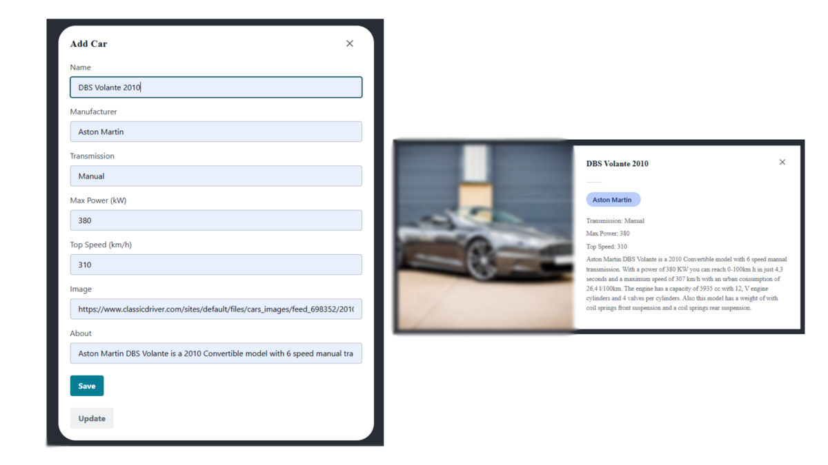
We need to add the following functionalities to our code:
- The
AddCarcomponent rendered after clicking on theAdd Carbutton in theNavBarshould have theSavebutton enabled and theUpdatebutton disabled. - A new car should be added to the collection after the form is filled out and submitted.
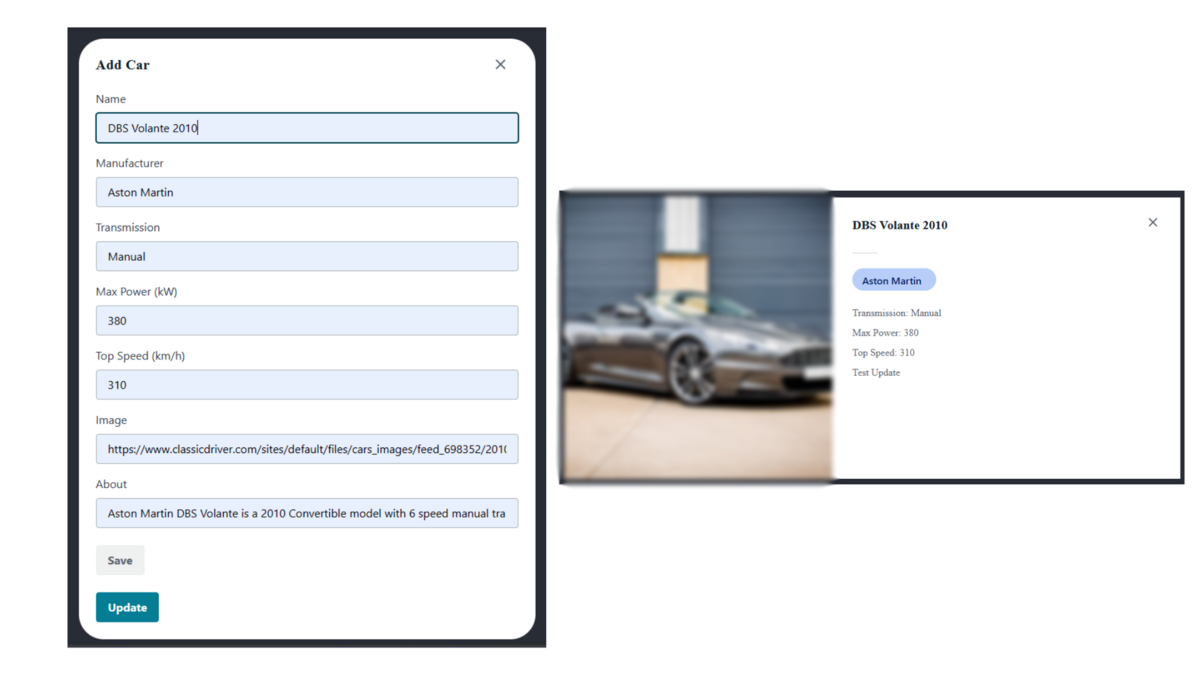
- The
AddCarcomponent rendered after clicking on theUpdatebutton in theCarProfilecomponent in the collection should have theSavebutton disabled and theUpdatebutton enabled. - The selected car should be updated after the form is filled out and submitted.
This is how our App.js file should look after adding these functionalities:
import "./App.css";
import { Cars, CarDetails, NavBar, AddCar } from "./ui-components";
import { useState } from "react";

function App() {
  // React Hooks
  const [showForm, setShowForm] = useState(false);
  const [showCarDetail, setShowCarDetail] = useState(false);
  const [car, setCar] = useState(null);
  const [updateCar, setUpdateCar] = useState(false);

  const [name, setName] = useState("");
  const [manufacturer, setManufacturer] = useState("");
  const [transmission, setTransmission] = useState("");
  const [maxPower, setMaxPower] = useState("");
  const [topSpeed, setTopSpeed] = useState("");
  const [image, setImage] = useState("");
  const [about, setAbout] = useState("");

  // Overrides
  const navbarOverrrides = {
    "Add Car": {
      style: {
        cursor: "pointer",
      },
      onClick: () => {
        setShowForm(true);
      },
    },
  };

  const formOverrides = {
    TextField29766922: {
      placeholder: name,
    },
    TextField29766923: {
      placeholder: manufacturer,
    },
    TextField29766924: {
      placeholder: transmission,
    },
    TextField3876428: {
      placeholder: maxPower,
    },
    TextField3876454: {
      placeholder: topSpeed,
    },
    TextField3876461: {
      placeholder: image,
    },
    TextField3876468: {
      placeholder: about
    },
    Button3876475: {
      isDisabled: !updateCar ? true : false,
    },
    Button29766926: {
      isDisabled: updateCar ? true : false,
    },
    MyIcon: {
      style: {
        cursor: "pointer",
      },
      onClick: () => {
        setShowForm(false);
      },
    },
  };

  const CarDetailsOverride = {
    MyIcon: {
      style: {
        cursor: "pointer",
      },
      onClick: () => {
        setShowCarDetail(false);
      },
    },
  };

  return (
    <div className="App">
      <header className="App-header">
        <NavBar width="100%" overrides={navbarOverrrides} />

        {showForm && (
          <AddCar
            car={updateCar}
            overrides={formOverrides}
            style={{
              textAlign: "left",
              margin: "1rem",
            }}
          />
        )}

        {showCarDetail && car && (
          <CarDetails
            carModel={car}
            overrides={CarDetailsOverride}
            style={{
              margin: "1rem",
            }}
          />
        )}

        <Cars
          overrideItems={({ item, index }) => ({
            overrides: {
              Button38514001: {
                onClick: () => {
                  setShowCarDetail(true);
                  setCar(item);
                },
              },
              Button38514005: {
                onClick: () => {
                  if (!showForm) setShowForm(true);
                  setUpdateCar(item);
                  setName(item.name);
                  setManufacturer(item.manufacturer);
                  setTransmission(item.transmission);
                  setMaxPower(item.maxPower);
                  setTopSpeed(item.topSpeed);
                  setImage(item.image);
                  setAbout(item.about);
                },
              },
            },
          })}
        />
      </header>
    </div>
  );
}

export default App;
Deleting a Car
In order to delete a car, we need to configure the CarProfile component in Amplify Studio and add an OnClick action on the Delete button.
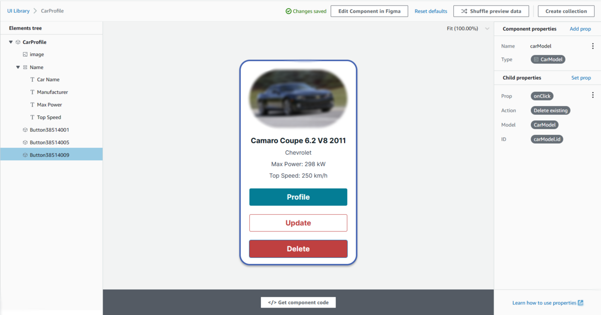
Simply do an amplify pull on your React code, and you should be able to delete cars after clicking on the Delete button on your CarProfile.
Adding Authentication to our App
At this point, our app behaves the way we expected it to. It can be used as a car database for creating, updating, and deleting new car profiles. For an extra layer of security, we will add authentication to our app.
Navigate to Amplify Studio and open the Authentication section. Amplify authentication allows various ways to sign in; it has the ability to set desired restrictions on user passwords; and it can also set a custom verification message. For authentication attributes, we will add Name, Profile and Email.
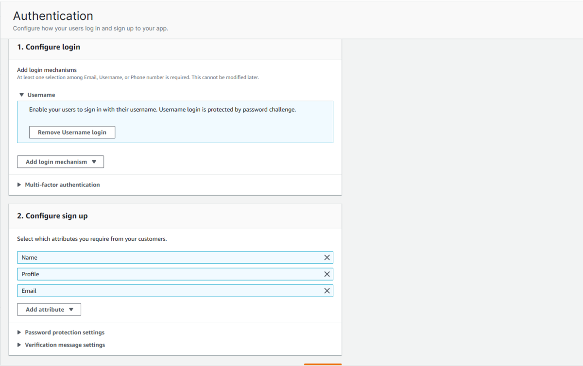
After the desired configurations are done, deploy the authentication settings. Amplify uses Amazon Cognito in the background for deploying authentication. Once deployment is complete, pull the changes into your local code with amplify pull.
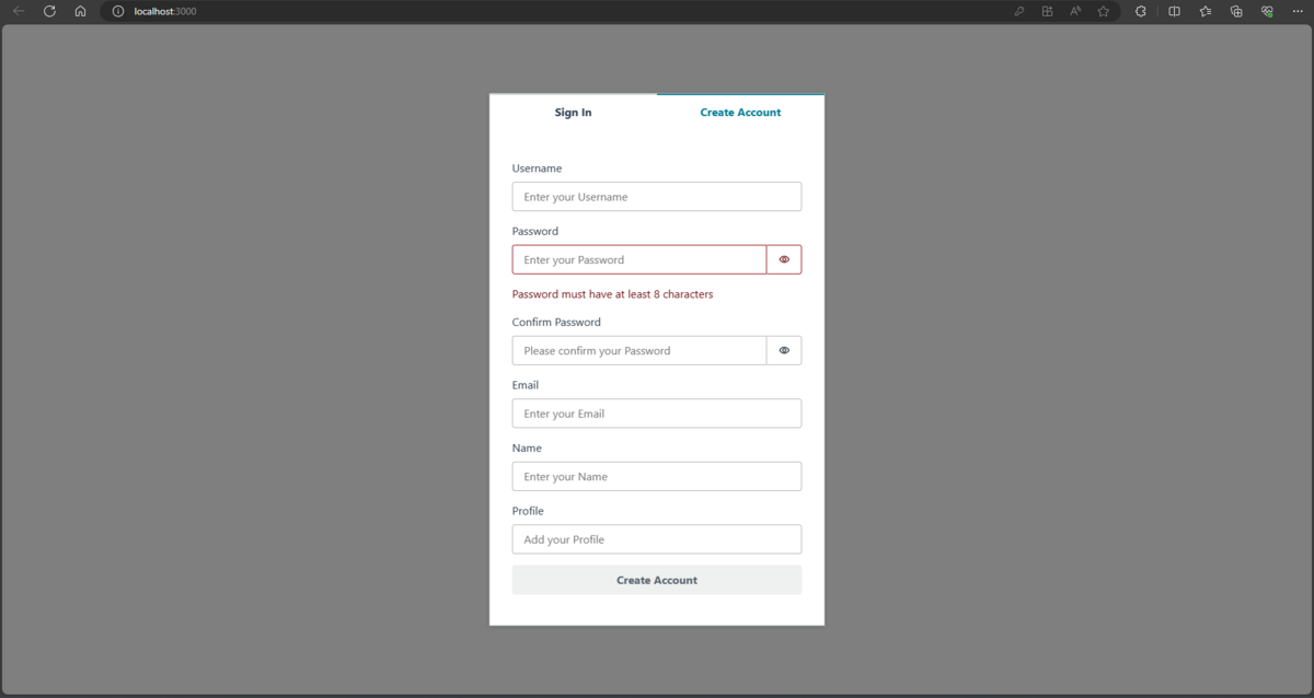
We will update our code by integrating with withAuthenticator from Amplify's ui-react library.
We want the following changes to show up in our app:
- If opened without a sign-in, the app should redirect to the sign-in authentication page.
- Users that log in successfully should get their profile image displayed on the
NavBar. - The
Signoutbutton on the navbar should sign out the user.
The final code for our App.js file should look like this:
import "./App.css";
import { Cars, CarDetails, NavBar, AddCar } from "./ui-components";
import { withAuthenticator } from "@aws-amplify/ui-react";
import { useState } from "react";

function App({ user, signOut }) {
  // React Hooks
  const [showForm, setShowForm] = useState(false);
  const [showCarDetail, setShowCarDetail] = useState(false);
  const [car, setCar] = useState(null);
  const [updateCar, setUpdateCar] = useState(false);

  const [name, setName] = useState("");
  const [manufacturer, setManufacturer] = useState("");
  const [transmission, setTransmission] = useState("");
  const [maxPower, setMaxPower] = useState("");
  const [topSpeed, setTopSpeed] = useState("");
  const [image, setImage] = useState("");
  const [about, setAbout] = useState("");

  // Overrides
  const navbarOverrrides = {
    Button: {
      onClick: signOut,
    },
    image: {
      src: user?.attributes?.profile,
    },
    "Add Car": {
      style: {
        cursor: "pointer",
      },
      onClick: () => {
        setShowForm(true);
      },
    },
  };

  const formOverrides = {
    TextField29766922: {
      placeholder: name,
    },
    TextField29766923: {
      placeholder: manufacturer,
    },
    TextField29766924: {
      placeholder: transmission,
    },
    TextField3876428: {
      placeholder: maxPower,
    },
    TextField3876454: {
      placeholder: topSpeed,
    },
    TextField3876461: {
      placeholder: image,
    },
    TextField3876468: {
      placeholder: about
    },
    Button3876475: {
      isDisabled: !updateCar ? true : false,
    },
    Button29766926: {
      isDisabled: updateCar ? true : false,
    },
    MyIcon: {
      style: {
        cursor: "pointer",
      },
      onClick: () => {
        setShowForm(false);
      },
    },
  };

  const CarDetailsOverride = {
    MyIcon: {
      style: {
        cursor: "pointer",
      },
      onClick: () => {
        setShowCarDetail(false);
      },
    },
  };

  return (
    <div className="App">
      <header className="App-header">
        <NavBar width="100%" overrides={navbarOverrrides} />

        {showForm && (
          <AddCar
            car={updateCar}
            overrides={formOverrides}
            style={{
              textAlign: "left",
              margin: "1rem",
            }}
          />
        )}

        {showCarDetail && car && (
          <CarDetails
            carModel={car}
            overrides={CarDetailsOverride}
            style={{
              margin: "1rem",
            }}
          />
        )}

        <Cars
          overrideItems={({ item, index }) => ({
            overrides: {
              Button38514001: {
                onClick: () => {
                  setShowCarDetail(true);
                  setCar(item);
                },
              },
              Button38514005: {
                onClick: () => {
                  if (!showForm) setShowForm(true);
                  setUpdateCar(item);
                  setName(item.name);
                  setManufacturer(item.manufacturer);
                  setTransmission(item.transmission);
                  setMaxPower(item.maxPower);
                  setTopSpeed(item.topSpeed);
                  setImage(item.image);
                  setAbout(item.about);
                },
              },
            },
          })}
        />
      </header>
    </div>
  );
}

export default withAuthenticator(App);
The users created through this process can be viewed and managed in the User management section of Amplify Studio.
And we're done! We have completed building our app as well as adding authentication to it.
Additional Amplify Features
Before wrapping up, I would like to give a brief overview of additional features that Amplify provides that could be tested on this app as well:
- Authorization Rules: Authorization rules can be created with the security identifier as an API key, an IAM user profile, or a Cognito user ID. These authorization rules control how much liberty the users can have while interacting with the data model objects in our app. CRUD operations can have different authorization rules for different users. You can also control the privileges to be allowed to signed-in and signed-out users separately. Custom authorization rules can be set using the GraphQL API through code as well. Select data models in Amplify Studio and experiment with adding authorization rules to our CarModel data model.
- Storage: Amplify provides the ability to add and store app contents in a backend S3 bucket. Using the Amplify CLI's
amplify add storagecommand, we can create a S3 bucket for our application. Different static media from our application can be uploaded into the bucket and rendered into our application. Go through Amplify's Storage documentation for instructions on how to work with storage options. - Hosting: Along with development, Amplify also offers the ability to host our applications. We would need to push our code to a new GitHub repository, which would act as a backend for our app. In Amplify's management console, we need to select
Host an appand provide Amplify with our github repository access, along with other requirements. We can host our applications on custom domains. Amplify also provides a CICD pipeline for each new update to the application. Stages of the pipeline can be viewed and managed from the Amplify console.
Cleanup
For cleaning up, simply navigate to Amplify Studio and select your app. Click on Action -> Delete. This will delete all the resources that Ampliy has created to support your application.
Closing Thoughts
As we conclude this three-part blog series on AWS Amplify, we've traversed a comprehensive journey—from an insightful overview of AWS Amplify and its components to the hands-on experience of constructing a full-stack web application on the Amplify framework, fortified with an additional layer of security. I trust you enjoyed this exploration and gained valuable insights into the fascinating realm of AWS Amplify.
Thank you for joining me on this adventure, and I look forward to welcoming you back in the future with a new blog series. Until then, happy coding!
Author:
Rahul Raje
JTP Co., Ltd.